
![[photo by Emily Witt | OhVarsity!]](https://images.squarespace-cdn.com/content/v1/5a2c2b4790bcce55e3166a34/1539308690510-ZG7SR0XUPOFVWH4RTYWZ/temp+5.PNG)
[photo by Emily Witt | OhVarsity!]
As a noted history and uniforms guy, the University of Cincinnati is a great school to be in love with. The Bearcats have it all in those two areas: A great mascot, a perfect color scheme, and a deep, rich history to pull from.
I’ll defend Bearcat football’s current uniforms all day. For whatever reason, many don’t seem to like what Under Armour has done for UC, but I’m a fan. It’s certainly better than Adidas before them and Nike before that.
Bearcats football has bounced around through apparel sponsors but one thing has remained consistent: Nobody has successfully mined that rich history, and only one company has tried. The 2015 alternate uniforms were… something. Don’t get me wrong, I love a good creative risk. However, the uniforms were a disaster aside from the tributes on the pants. The helmets were interesting, and overall a thumbs up from me, but just too odd.
I took it upon myself to put some helmet concepts together. Most (but not all) are based on a historical element.

The First Bearcat Helmet
Prior to the 1950 season, the only helmets UC ever had were either leather or a solid-colored shell. It wasn’t until 1950 that any kind of design entered the picture. The ‘Cats wore these from 1950 until they finally switched (to their first black helmet) in 1961.
Going without a helmet logo in 2018 is basically unheard of, and most of the teams that do so don’t truly commit. Michigan has the winged helmet (which is basically a logo, if we’re being fair). Ohio State fills their blank helmets with buckeye leaves. Alabama has jersey numbers on theirs.
There are 130 FBS teams and only Army, Boston College, Navy, Notre Dame, and Penn State play with blanks. (That’s just about 4%.) Only Penn State uses a color other than gold.
I’d love for Cincinnati to try it as an alternate. Even though the current branding is modern, the program is old enough (133 years) to claim the retro look as part of their brand. And since switching to “modern” helmets (a.k.a. helmets with facemasks) in 1950, they’ve gone logo-less for 14 seasons—plus one random game in 1990 by accident.

The Brig Owens
The 1964 Bearcats went 10-1, setting a new school record for wins in a season. The man leading the charge was Brig Owens, a scrambling quarterback who also saw reps at halfback, kicker, and punter. After transferring to Clifton from junior college, Owens piloted UC to a 16-5 record and two MVC titles before being drafted into the NFL and embarking on a remarkable 10-year career with the Redskins.
The brief, successful Brig Owens Era is often overlooked in UC history, but we can pay homage with their helmets.
Making their debut in 1962, the classic “UC” lids marked the first time the Bearcats wore a logo on a helmet. Prior to switching to the (old) C Paw in 1990, the Bearcats wore some variation of a “UC” design every year (aside from 1983) since 1970.
Some designs of this era adapt poorly to modern templates, but I think this one works wonderfully. This might be my favorite helmet from this exercise.

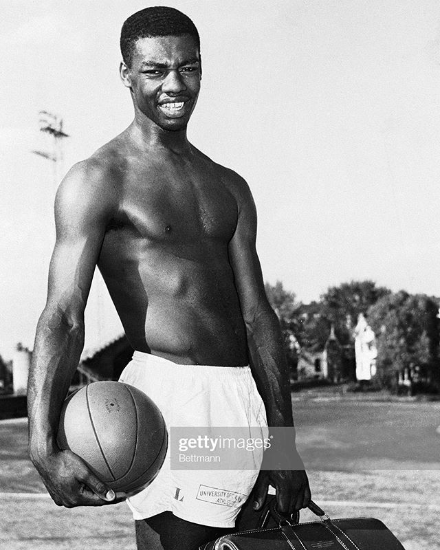
The Greg Cooks
Fifty years after he last took the field in Clifton, Greg Cook is still probably the most famous Bearcat to ever play the position. After lighting up defenses during his senior year in red and black, Cook was drafted by the Bengals 5th overall in the 1969 NFL Draft.
He went on to win Rookie of the Year honors while leading the league in passer rating and throwing an absurd 17.5 yards per completion, still a record for a rookie. Unfortunately, Cook suffered an injury early in that season. While he was able to return and finish out the year, he never received proper treatment and his throwing shoulder quickly deteriorated, ultimately ending his career as quickly as it had started.
Bengals owner Mike Brown calls Cook “the single greatest talent we ever had here.”
These solid red helmets with a white stripe were worn for just one season—Greg Cook’s senior year. They’re simple and the historically-accurate facemasks make them look vaguely like an alternate Ohio State helmet, but I like them. UC has never quite figured out red helmets, and these are as good as any.


The Red Cats
Arguably my favorite Bearcats logo tragically came before logos and branding were emphasized in college athletics. The Bearcats had the ‘red cat’ from 1959 to 1968, meaning this angry-looking guy saw Oscar Robertson, Greg Cook, and two national championships. Unfortunately for him, logos and branding on uniforms was uncommon at the time. You can find him on warmups and signs from the era, but they never adorned helmets or jerseys of any sport (to my knowledge).
Problem solved! The most storied logo in Bearcats history is back, modified (without the wordmark) for use on an alternate helmet near you! Also included is an alternate logo featuring just the cat head.
As a side note: I think my favorite thing about this logo is the shade of red they used. I’ve noticed UC’s red used to be darker—basically maroon if you go back far enough. Frankly, I like it a bit better than the bright red we’ve used in modern history.


The Dueling Horseshoes
The Bearcats came thiiiiis close to breaking out the “dueling horseshoes” helmet decals in 2017, per a source. They would’ve looked like this. With a black facemask, these are accurate to the 1985-1988 helmets.
I have a soft spot for this logo. UC was not good during this period, and their best record while wearing the horseshoes from ‘84 to ‘89 was a measly 5-6. (Actually, I believe this is the reason the 2017 tribute was ultimately pulled.) However, it’s kind of a cool logo. The simplicity is great and it screams ‘80s UC to me. The university’s current logo is much more reflective of 2018, but it’s sterile in comparison to the horseshoes.
Also included is an alternate version using a more stark black and white scheme.

The Gray Cats
Now we’re getting weird with it. Prior to Under Armour’s cartoonish ‘Bearcat emoji’ and Adidas’ corny Bearcat eyes*, there was Nike’s gray cat. Of the three, I like Nike’s is by far the most successful, and I find it ironic because it’s also the least accurate. This looks like a house cat, and it’s not in UC’s colors, but it works for me. (Maybe it’s nostalgia.)
Much like the Bearcat emoji and eyes, this was never used prominently, and that was kind of the idea. These helmets thrust the Nike cat to the forefront of a uniform that embraces the odd decision to use gray for the Bearcats. They don’t really look like UC, but they’re kinda cool.
*Anyone who likes the Bearcat eyes shops exclusively at K Mart and owns the same Cincinnati Reds hat collection as Pete Rose.

The ‘90s C Paw Throwback
This might be the retro concept I’d most like to see. It also might be the retro concept least likely to happen. I asked around about the potential to see the old C Paw on football helmets, and was told it’s a branding issue. Given that UC only updated the C Paw in 2005, they’re hesitant to go back to the old one in any fashion.
From a branding standpoint, I understand why this might be the case. You don’t want to spread the brand too thin, and mixing in tons of an old mark isn’t a great way to keep the current one strong. On the other hand, UC recently relented for basketball and allowed the ‘92 throwbacks. They also offer merchandise with the old C Paw on it. As a fan, I’m happy for all of this, and I’ve bought multiple throwback shirts. I’d just like to see it hit football.
The ‘90s football team never wore the C Paw on a white helmet, so this would be some kind of ‘90s alternate concept. Back then, they also used to stretch the logo horizontally to better fill the helmet, which I think makes it look cheap. The original C Paw is quirky and old looking (and I love it for that) but it looks much sharper if you leave it alone and slap it on the helmet.

The Red & Blacks
Pay attention to UC’s branding and you’ll notice that red and black are very rarely used next to each other, despite being the school’s primary colors. In fairness, there’s a reason for this. White on top of red or black is always more legible and easier on the eyes in general. That being said, I think it provides a good opportunity for alternate uniforms and helmets.
Remember the bizarre ‘blackout’ basketball uniforms in 2012? Those flirted with this idea. I’m not arguing Bearcat football should make all type on their uniforms illegible, but there’s an opportunity for a bold alternate helmet at least.

The Matte Blacks
Aaaaand we’re back to where we started. Rutgers just got matte black and it reminded me of what UC has been missing out on. The closest the Bearcats have come was in the 2011 Liberty Bowl. Honestly, I really like those helmets, but they’re not proper matte.
These are.
It’s odd that a texture can drastically change the look of the same helmets the Bearcats wear for nearly every game, but it does. While the rest of this exercise sought to find sufficient alternates, I think these would work as a primary helmet, at least for a season. Make it happen, someone.


![University of Cincinnati’s home from 1875-1895, next to Bellevue Incline. [photo taken in 1906, Detroit Publishing Company] #Bearcats](https://images.squarespace-cdn.com/content/v1/5a2c2b4790bcce55e3166a34/1563207714132-SOSY9OKXDG55TJA5QUN8/image-asset.jpeg)
![November 18, 2006 | Mark Dantonio and the Bearcats take down #7 Rutgers. [photos: gobearcats.com]](https://images.squarespace-cdn.com/content/v1/5a2c2b4790bcce55e3166a34/1560900133221-TRO20CHJZH0OWJX5DEYC/image-asset.jpeg)
![Semi-annual ‘90s (pre-Jordan) uniform appreciation post. [via Getty Images - bonus ‘96 Paul Pierce on slide 2]](https://images.squarespace-cdn.com/content/v1/5a2c2b4790bcce55e3166a34/1560452066508-T0JQQKVXCVY9N0G9RLUD/image-asset.jpeg)